


Gung Ho
Gung Ho, an advertising agency in Mauritius, approaches its 10th year anniversary in 2019. To mark this occasion, they decided to revamp their logo and corporate branding. The old logo, being an image, was not user-friendly – whether on stationery, as signage, or even on digital platforms. The criteria while designing the new logo was to preserve the military theme and to consider a more type-driven approach.

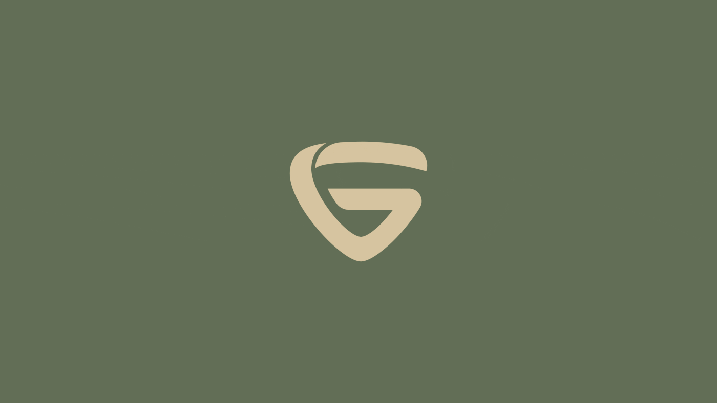
The most prominent feature of the old logo was its basic shape – the inverted triangle. This was the inspiration for the creation of the 'G' in 'Gung Ho'. A whole new logotype was then crafted based on the features of the new 'G'. The subtle curves and cuts in the logo are reminiscent of a warrior's knife. The new colour palette remains within the military theme, but is more muted, understated and contemporary. Visually, the logo's evolution is evident in the new design.


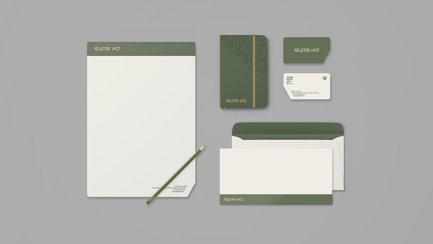
The corporate stationery is minimalistic and simple in design. Rounded corners complement the curves of the logotype with one edge that is cut on a sharp diagonal, reflecting the essence and character of the logo itself. Gotham, a modern sans serif typeface, chosen for its boldness and high legibility, is used in all collaterals to contrast and complement the new logo.


Credit: Gung Ho
Logo concept/corporate identity – art direction + design: Anne Sujo
Warrior knife/packaging + outdoor signage: Ajaghen Seeneevassen
Logo animation (opening frame): Yeshna Dookhee
Production co-ordination: Nootan Jhugroo
Creative team: Anne Sujo, Ajaghen Seeneevassen, Thierry Buffion


